


According to Google Research,* users form an opinion about your website in 0.05 seconds. Suffice it to say, first impressions matter, and nowhere is this more imperative than your homepage. A well-written and designed homepage can make or break your ability to retain visitors and convert browsers into buyers.
A website that creates an impact in a short amount of time avoids common copywriting mistakes, taps into homepage buying psychology, and employs a smart layout strategy.
(And hey, bloggers, you need a homepage too. Not just a blog post page, but a homepage to drive your followers to subscribe to your email list, shop your storefronts, and connect with you on a personal brand level. Read on to find out how… )
Trending homepage copywriting mistakes
The rise in code-free site-building platforms like Squarespace and Showit makes it easier than ever to DIY your business’ website. But with a new website built every minute, gone are the days when your site could function like a glorified fast-food menu.
To stand out from the crowd, retain your reader’s attention, and convince them that your product or solution is exceptional or a better fit than your competitors, you need to avoid the most common homepage copywriting mistakes.
1) Verb-Empty Hero Headline
Headlines that read like “fridge-magnet poetry”, (i.e. Dream. Inspire. Impactful memories.) are meaningless to your readers. The very first piece of copy your readers see should be actionable. Starting with a verb immediately mobilizes your reader to follow your lead.
BP Client Talent Track Solutions burst out of the gates with, “Transform Your Talent Acquisition Strategy”. It’s actionable and immediately calls out her client’s desire to “transform” an ineffective piece of their operations.
Alternatively, you can craft a concise and attention-grabbing headline that clearly communicates the primary benefit or value proposition of your offer. BP Client CoCreative Interiors positions her unique approach to her services with the hero: “What you love + what you need. Interior design that feels like home.”
Whichever hero header tactic you use, your copy should give visitors a reason to want to stay on the page and learn more about what you offer.
2) Not understanding how to use a subheadline
The subheadline provides additional context or elaborates on the headline. It should never introduce a new tangent or irrelevant idea. And you don’t have to have one. Sometimes less is more.
3) Missing intro hook
You know what’s easy? Procrastinating or pretending a problem will go away on its own.
You need an introductory hook or “big idea” that lays out why it’s imperative, urgent, and/or valuable enough an offer for me to stop procrastinating and take action.
Great copywriters will write dozens of different versions of “the big idea” to find the most compelling value proposition or reason someone should break the status quo and start the buying process.
“Flip the script” to find your hook with the Audience Persona & Brand Messaging Workbook.
4) Confusing/missing navigation bar
Sixty-one percent of website users expect to find what they’re looking for within five seconds of landing on a website. However, every couple of years a design trend rolls along that tries to do something clever with the primary navigation—usually by hiding it.
Imagine walking into an unfamiliar mall to buy a diamond ring and not being able to find the store directory and map. Making your website users work to find a complete list of pages or giving your pages overly creative names so they have to guess which pages will contain the information they are looking for is the equivalent of making them wander around a five-story mall. They will get fatigued, frustrated, and overwhelmed and are likely to leave without buying your diamond ring.
Put your most important page links in the primary nav, add the rest to the footer, and for the love of my 90s-era Wet Seal obsession, don’t get cutesy with your page titles.
5) No primary CTA or clear next step
This is becoming a bigger issue as websites have become hubs for diverse, content-heavy brands. Even if you offer services, blog posts, free opt-ins, courses, and an online shop, too many paths create decision fatigue. One tell-tale sign your visitors don’t know which action to take is if your time on site analytics is high (multiple minutes) but your conversions are low.
When I have a client with multiple offers we take one of two strategies: 1) We choose one offer and dedicate at least 50% of the page toward its promotion or 2) We ask website visitors to identify their needs and direct them to the appropriate landing page. This is especially common for businesses that serve two similar, but distinct audiences, like done-for-you (1:1 services) vs. DIY offers (courses, workshops, memberships).
6) Not positioning yourself as the expert and guide
We tend to downplay our abilities because we’re afraid of coming off like a self-important ego-maniac. So your homepage bio usually reads like a dating profile, citing your love of dogs and tacos. But guess what? I don’t want to date you. I want you to bring your skills to an area of expertise I suck at and use them to solve my problems.
You have to get over yourself and figure out why your past experiences or work will make me feel at ease about hiring you or buying from you. You don’t have to be The Best In All The Land™, you have to be the best choice for me and my needs and constraints. Your website is a job interview, so give me your best.
Psychological factors to consider on your homepage
Perceived value affects your pricing
When you clearly articulate the value your customers will receive by highlighting the benefits of your services and products, your reader will subconsciously assign an estimated value to your offers. If your perceived value doesn’t align with what you charge people will push back on your pricing. You want people to think, “Of course, this costs this much—it’s obviously worth every penny.”
Cognitive fluency reduces decision fatigue
People prefer things that are easy to understand and navigate. As you scroll down the page, each section’s messaging should flow into the next or feel like a natural baton pass. (Not like you’re me, circa 7th grade P.E. and your partner comes out of nowhere so you drop the baton.)
We buy with our emotions and justify with logic
Marketers everywhere use storytelling to sell because stories create emotional connections. But pay close attention and you’ll notice every story is followed by logical proof that the product or service delivers on its promise. Case studies (Nike loves to show their athlete’s early struggles juxtaposed with their recent wins), testimonials (“After just two weeks I saw improved…”), stats (One in three men prefer…) But why does it work on us? Because we need to see ourselves in these stories to believe that we’ll get similar results.
We need decision-making triggers
Telling your readers why something is important is rarely enough on its own. The final step to get your audience over their tipping point is to tell them what to do, directly. Clear Calls to Action (CTA) guide visitors on what to do next: “DOWNLOAD NOW”, “BUY NOW”, “ADD TO CART”, “START THE PROCESS”, “BOOK YOUR DISCOVERY CALL”, “FILL OUT INQUIRY FORM”. CTAs should use short, actionable language that makes it 100% clear what will happen once they click a link or button.
Our brains seek out patterns
To conserve energy our brains have adapted to quickly identify patterns that increase our ability to complete a task with minimal effort. We know that when a friend tells us a story about the crazy thing that happened to her last night, she’s going to set the scene, build the tension, reveal the peak drama, and tell you how it all resolved. This storytelling pattern should be used on your homepage to keep your reader’s attention so they are glued to your every point and with you to the end.
What’s the best homepage layout strategy?
The best homepage layout strategy depends on your industry and niche but every business can start with this Homepage Copy Template framework and adjust based on your buyer’s priorities.
A high-converting homepage should be laid out logically so your buyers are seamlessly presented with your offers’ benefits, unique value proposition, brand story/bio, offer stack, and the picture-painting sales narratives that result in conversions but…
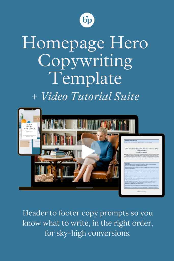
But the perfect layout is ineffective without compelling copy to go with it. The Homepage Hero Template + Video Tutorial Suite takes you from header to footer with easy-to-follow copy and header prompts so you know what to write, in the right order, for sky-high conversions.
Plus, I take you through my Audience Persona & Brand Messaging Framework so you can “flip the script” and reverse engineer your copy in 20 minutes.
WHAT ELSE IS INCLUDED?:
- Homepage Copy Template (accessible in Word or Google Docs)
- Homepage Skeleton Framework
- Over-The-Shoulder Video Tutorial (~20 min Watch Time, Timestamped, Closed Captions, Transcription Included)
- The Audience Persona & Brand Messaging Masterclass Recording (~20 min study time, includes my Brand Voice Lightning Lesson)
- The 4 Types of Buyer’s Cheatsheet and Checklist
- The Copy Sweeps Editing Checklist
- The BP Brand Voice Chart & Worksheets
- Big Picture DIY Copywriting Resource Index (All the BP freebies and resources linked and organized by copy needs.)
- $50 OFF a 1:1 Copy Audit + Power Hour with Courtney (your future Editor-in-Chief)
*All 2023 website stats are sourced here.


")


