


When you think about conversion copywriting, you’re likely thinking about the phrases and messaging that will compel your audience to take an action.
But even if your copy is on-point you can undo your hard work by creating unnecessary barriers that turn away those perfect-fit leads who were loving every word you wrote.
It all comes down to your website’s user experience—what you’re saying and NOT saying and the hoops you’re making your readers jump through in order to make the decision to reach out.
This isn’t a technical post about UX copywriting (that’s a whole other post, TBD), but for reference, UX Copywriting is the art of structuring the copy in such a way that it pulls readers down the page and provides easy support and guidance that lightens the “mental load” required to make a decision. (To buy, subscribe, click, or pass.)
UX copywriting is traditionally a specialty role used by product companies, but today’s websites are products and your readers are the users. Good UX is no longer reserved for apps and SaaS (software as a service) companies.
You can start creating a better website user experience by asking yourself:
-
When a reader lands on a page, is it obvious what their next click should be?
-
If you’re giving readers the option to “choose their own adventure” do each of those adventures end where you want them to?
-
Are you making them do any extra work? (You’ll see what I mean below.)
-
Are you setting pricing expectations?
-
Is it clear which offer they should choose?
Here are the 5 most common reasons your perfect-fit leads leave your site without reaching out.
1) Your services aren’t listed on your homepage.
Attention spans are shorter than ever and your prospects are on a mission. They are looking for your offers to see if they match their problems. Give them the Three Doors trick. Lay out your top three offers with a 1-2 line description and a CTA button to “Learn More”. Make it easy for them to choose a door to enter.
From there you can take them to a Services Splash Page (all your offers on one page) or individual offer pages. (Read: Which Services Page Is Right For You?)
Also, this should go without saying but if your services aren’t listed anywhere on your site, you’re making it impossible for colleagues and happy clients, who did jump through the hoops, to refer you to a friend. I speak from experience as someone who has wanted to send a client a link to a specific offer I know would be a perfect fit, but couldn’t find the page link and was too busy to take the extra time out of my day to go searching or emailing. People are BUSY, y’all!
2) You’re making them request a pricing guide.
Unless you have brand-name recognition or your average client investment is above $20K, don’t do this. I will die on this hill.
“But, Courtney, someone who is serious about working with me will make the effort…”
No, they won’t. People are busy and will take the path of least resistance, every time. (i.e. They will exit your site and click over to the next person on their list.) It doesn’t matter how many Gs they have in the bank, or their monetary expectations, you’re making them work to offer you money. (?!??!)
Pricing guides are a massive waste of time—prospects need to know if they can afford to hire you or not. And even if they can afford you, think about the user experience you’re creating:
Here’s a poor user experience scenario:
The prospective client likes what they see and are interested in learning more > They fill out a form > They wait for the guide to hit their inbox > they get distracted by their inbox/Slack/DMs/looking at your competitor’s site > pricing guide arrives but they are busy > three hours later they open your guide…
Path 1: They don’t have the budget to work with you and you wasted their time and took their email without earning their trust or providing some value in exchange.
Path 2: They reached out to someone else (with transparent pricing) hours ago and already have a meeting on the books. Their motivation to reach out to you is low and they might wait until they chat with your competitor first.
Path 3: You’re within their budget range > they click the link to set up a meeting but their first interaction with your brand put the onus on them, when they are reaching out specifically to get rid of more responsibility. You’re digging yourself out of a 5/10 brand experience from the get-go.
There is one scenario where I’m okay with using pricing guides… ⤵️
3) You’re not setting any investment expectations on your site.
The only time pricing guides are acceptable is if you’ve given some indication of the average client investment or price range for an offer. You also want to make it clear if several offers are often packaged together, signaling another level of investment.
Helping your prospect set proper expectations is an act of kindness and good service.
If your offers are highly customized, give a range. If your offers are often combined with a la carte services, make that clear with one line of microcopy after the offer description or just before the CTA button.
Here’s some swipe copy to help you talk about pricing:
-
Starts at $1,500
-
From $1,500
-
Price: $1,500
-
[Business name] clients interested in [offer name] invest between $2K-$5K, on average.
-
This offer is often combined with [a la carte offer].
-
After our initial chat, [business name/I] will propose a custom Statement of Work that aligns with your organization’s needs, timeline, and estimated budget.
-
Not sure what you need? Grab a time to chat and let’s discuss.
4) Overly clever offer names.
I love a clever pun or play on words, but you don’t get points for confusing your readers. Your offer name needs to suggest what it is and/or who it’s for. Remember, your readers will take the path of least resistance, every time.
Clever offer names can work if each of your offers play off a theme and there is a clear hierarchy. For example, Copywriting Cohort Course student, Angie Allen is a web designer for real estate agents, interior designers, and other home industry professionals. Her offers are called the Studio, Bungalow, and Chateau packages. It’s obvious that the scope and pricing for each correlate with their name.
(Also, she’s using the Three Doors trick to make comparison easy and lighten the mental load.
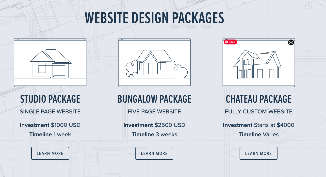
Client portfolio: Angie Allen Web Design
5) Your offers sound the same.
This is a big offender in the coaching community because it tends to happen when the offer goals are the same but the container is different. For example, think about group coaching programs vs. 1:1 coaching. Your job is to make it clear to your prospect why they would choose one offer over another. (And you have to do better than “you’ll gain access to a community of like-minded individuals”. That’s a given.)
You need to sit and reflect on the true value you’re providing and write that into your copy. Why would I be better suited for a group environment instead of 1:1, or what scenarios might I be dealing with where 1:1 coaching is going to be more effective? Flip the script, why would a group program fail to meet my needs? Why might I not be ready for 1:1 coaching yet?
Furthermore, you need clear sets of deliverables that differentiate your offers from each other. You can have some cross-over, but if there’s only one bullet point that differentiates one offer from another, maybe you’re selling your clients short and not providing them with enough value. It’s worth thinking about.
(Here’s a great example of three distinct homepage offer presentations from Vamonos Coaching.)

Client Portfolio: Vamonos Coaching
The best way to improve your website’s user experience…
The best way to understand what it’s like to be in your prospect’s shoes is to “eat your own dog food”. Work with someone and invest the same amount of money in them as you’re asking of your prospects.
Alternatively, play pretend and start searching for service providers who do something you know you need now or in the near future and pay attention to what you’re paying attention to. (This is also a great life mantra, but I digress…)
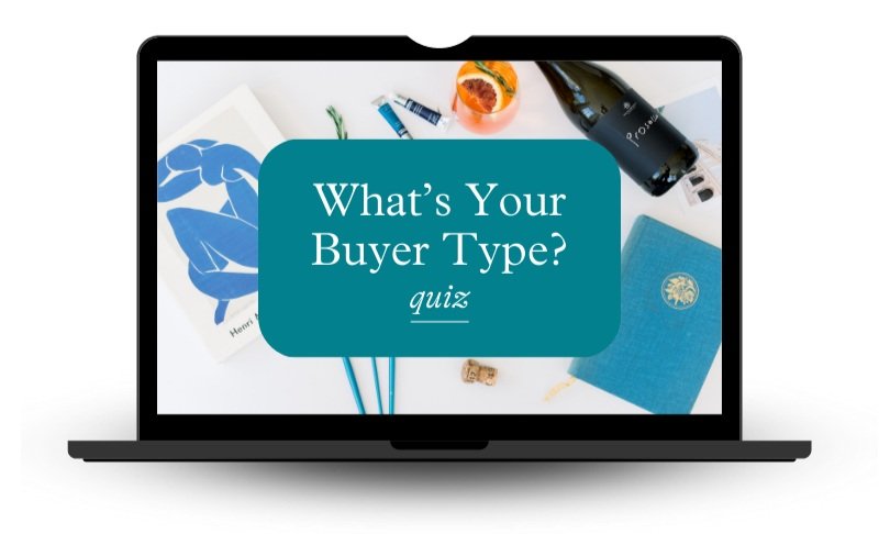
Another way to better understand how YOU like to be sold to is to take the 4 Buyer Types Quiz. If you’re The Director result, you’re going to want to make a checklist of all the ways your copy is neglecting The Socializer, The Relator, and The Thinker. When you understand your copywriting blindspots you can write stronger sales copy and design a better website user experience from inquiry to a signed contract.
TAKE THE QUIZ
Write stronger sales copy by knowing how you like to be sold to (and where you’re leaving money on the table.)
If you found this article helpful…
The BP Resource Library started as a way to offer brand strategy and copywriting education to creatives and entrepreneurs with champagne tastes but a Pellegrino budget.
If I’m helping you make more sense of this whole “writing for your biz” thing, please consider expressing your appreciation for the research, writing, and design that goes into each and every post and library freebie.
Buy me a coffee
PIN IT TO SAVE FOR LATER


")


