


If you ask me what the most underutilized conversion copywriting element is on your website or sales page, I’d blurt out “call-to-action button copy” before you even finish your sentence. Next to your hero header and “hook”, your CTA buttons are the most important catalysts for action.
Without clear and compelling CTAs, visitors will scroll aimlessly, X out of your site, and never engage with your offerings or convert into leads or customers.
Ace CTA copy should compel your readers to take action, clarify what will happen next (after they’ve clicked), and in the right circumstances, create a sense of urgency.
Most businesses don’t think twice about CTAs, but simple tweaks can result in better conversion. (For some stellar A/B testing examples, check out Unbounce’se case studies on the matter.)
Well-crafted calls-to-action direct your readers toward the next logical step in their buying journey. If your website isn’t converting, it’s time to learn to how to write strategic calls-to-action, the 3 types of CTAs, and where to put them.
How To Write Compelling CTAs
The first rule of thumb is to use persuasive action verbs, like Explore, Start, and Enroll. Next, you want to be specific—explore, start, and enroll in what?
Consider adding a sense of urgency—visitors will procrastinate and default into thinking they can come back later when really, you want them to take action right away.
And above all, keep your copy concise. Anything more than five words should be pulled out and reworked as microcopy placed underneath the button.
CTA Examples:
Bad → Join
Okay → Join Course
Better → Enroll Now
Best → Hit Play on Module 1 Now
Clickable Microcopy Example:
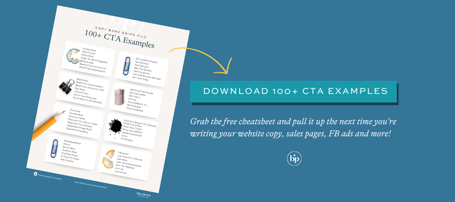
^See what I did here? The copy makes it clear that you get a valuable downloadable asset and the microcopy clarifies that the cheatsheet is free and meant to be used as a resource for later. Since this is a freebie you can access at any time, I didn’t make the messaging feel urgent, but I did give a few use cases to make downloading the asset more compelling. (Plus, the sheer number of examples is a persuasive argument.) Click on the CTA banner or here to grab your CTA cheatsheet.
3 Types of CTAs
Writing CTAs for different stages of the sales funnel means understanding where your buyer wants and needs to go next. By aligning your CTAs with the specific needs and mindset of users at each stage of the buyer’s journey, you can effectively guide them to consider your offer and make an informed decision one way or the other.
Awareness Stage CTAs are invite readers who are new to your business to explore what you’re all about. You’ll call them to read your blog posts, articles, and videos so they continue to engage with your brand and content. Your CTAs might encourage people to subscribe for more, hit the “like” button, or join your newsletter.
Consideration Stage CTAs aim to help your visitors evaluate your offer to make sure it’s the right fit. Your CTAs might nudge people to book a demo, start a free trial, or schedule a discovery call to receive personalized guidance. The goal is to direct them to the next logical step in their buying journey.
Decision Stage CTAs cut to the chase. All Big Picture Copywriting templates end the page with a “Last Chance CTA” section where the goal is to tell people exactly what to do next. Your CTAs should prompt action, de-risk the decision-making process, and make them feel excited about making an informed decision that will help them achieve their desired goal. These CTAs might include urgency since this is usually the final CTA on the page. (Examples: Save your seat, Book your spot, Start for free, Try now—no credit card required!.)
Where To Place CTAs Strategically
Every website page should have a call-to-action above the fold (top of the page near the hero header or intro), at the mid-point (near the deliverables and investment sections), and at the bottom of the page. You can certainly have more than three, but this is the minimum to ensure your reader is prompted after every major sales argument where your buyer will naturally clock whether they’re still interested in your pitch.
Strategic CTAs, FTW
Hopefully, you’ll never look at CTAs the same way again. Your CTAs should lighten the cognitive load you undertake every time you have to make a decision. Your button copy should help focus your reader’s attention, provide clarity, provide mental and on-page shortcuts (ex: Say no more—take me to the checkout page) evoke emotional responses, and facilitate decision-making.
PIN TO SAVE FOR LATER


")


