The stats are in and the number of new businesses in the U.S. is BOOMING. I can’t seem to listen to a single podcast or radio program (#nprmarketplace4lyfe) without hearing someone musing over this fact.
It goes without saying, but the year-that-shall-not-be-named forced a lot of us to shift gears and gain a few new skills. If you’re a new business owner, or if your role in your department got a facelift, I imagine you’re doing a lot more marketing and writing than you’re used to.
You might even be sighing to yourself, “Ugh, why am I doing this? I am NOT a copywriter!”
But the truth is, EVERYONE IS A COPYWRITER.
Yep! “Copywriter” may not be on the top of your resume, but if you create any form of communication that explains something and tells people what to do next, that’s copywriting right there my friend.
But you don’t need to be a wizard with words to learn how to grab your audience’s attention and communicate effectively.
What you DO need to understand are the basics of how we read and consume (or skim) content online. Why? Because writing for an online audience is a totally different ball game from writing an MLA essay. (Ugh…the memories.)
Having a distinct brand voice is super importan-tay, and you’re always one Google search away from learning the copywriting basics, but here’s a copywriting secret I bet you haven’t come across:
How your copy sits on the page and grabs your eye is just as important as the words and phrases you use!
Here are six copywriting tips that will help keep your reader’s attention that have nothing to do with the actual words on the page.
01) Place important content on the left
As Beyonce once said, put your most important copy to the left, to the left! That’s how I interpreted her, anyway…
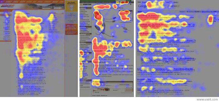
Because we’re trained to read everything from left to right, eye-tracking studies show us that the instant a webpage or new document loads on our screen our eyes dart to the top left-hand side of the page first. We then scan across to the right and then drop down to repeat this motion, forming an F-shaped pattern.

Image: UX Planet
If we don’t see something that hooks us, our interest inevitably peters out. But that’s where this next trick comes into play…
2) Headlines and headers for the skimmers
Thanks to diminishing attention spans, you’ve got mere milliseconds to grab your reader’s eye. As if that weren’t enough of a challenge, you then have to keep propelling them down the page, delivering dopamine-inducing rewards to keep them engaged.
Enter the header text. Breaking your content into sections using short header copy acts as a natural mechanism to pull readers down the page. Great headers even help deliver important information to someone slightly checked out, who’s just skimming the page. (You know we all do it!)
3) Keep your paragraphs short
In high school, I remember one of my teachers had a strict five-sentence paragraph minimum. Anything less than that was considered incomplete. Welp, the internet doesn’t fall under your teacher’s jurisdiction and you can get a full A-grade with less.
Email marketing is notorious for using one-liners and for good reason. Tests have shown that shorter chunks of content perform better. I have a hunch this is also because it’s easier to follow single lines on mobile devices. The key is to make sure you’re grouping similar ideas together and breaking them apart naturally.
4) Don’t be afraid to go bold
Styling bold text or underlining important points tells your readers “hey, this thing is super important, so pay attention!”
But, as the saying goes, use it, don’t abuse it. Too many pops of bold text, and you’ll confuse your reader. Their brain will start to ping-pong around the page instead of focusing on one thing (which is the whole point of making something bold.) It’s also important to decide if the underlined text looks too much like a hyperlink and will frustrate your readers.
5) Interjections? Yes, please!
Asides, quips, interjections — I use the term broadly but they all fall into this category of speech. And yes, this one is a purely stylistic choice, and might not be appropriate for your brand voice. Personal brands and brands with an informal tone can use interjections to break down the “third wall” and make your readers feel like you’re sitting right there next to them, having a chat.
The thing with interjections is, you have to test your audience’s boundaries. How much is too much? Will your readers understand your asides? Are your interjections actually interruptions causing your readers to lose the thread and miss your point? I love using interjections to insert my brand personality into my writing, but never at the expense of clarity. (Also, is it weird that I didn’t use a single interjection throughout this paragraph until this here ending? See the previous point regarding clarity. )
6) Good design is your friend
I cannot stress this one enough: Copywriters and designers need each other. A wall of black-and-white text will cause your readers’ eyes to glaze over pretty quickly. For any designers reading this right now should also know that even your most gorgeous work needs compelling copy to convince your readers whatever you’re selling is worth the investment.
Great design grabs your attention and great copy closes the sale. Design can amplify your message, help your readers understand a concept, and feel a certain way about your brand. Great design can even help those of us who tend to get a little wordy (guilty🙋♀️) figure out which elements are better to show instead of say.
Let design do some of the heavy lifting and watch your page conversions soar! The only caveat is this: Copy should guide the design layout, and not the other way around. Copy first, always.
Final thoughts
As with everything, any stylistic liberties you take with your writing should still jive with your brand and audience. If you’re still trying to figure out who your audience is and how to talk to them, I created the Audience Persona Builder and Brand Messaging Workbook to help you out!
PIN TO SAVE FOR LATER

